- chitralekha@ceebeedesignstudio.com
- Home Owner Bangalore - +91 8697306015
- Home Owner Kolkata - +91 8697306015
- Other Enquiry - +91 91470 08329

By :
Cee Bee Design
Studio

February 02, 2020
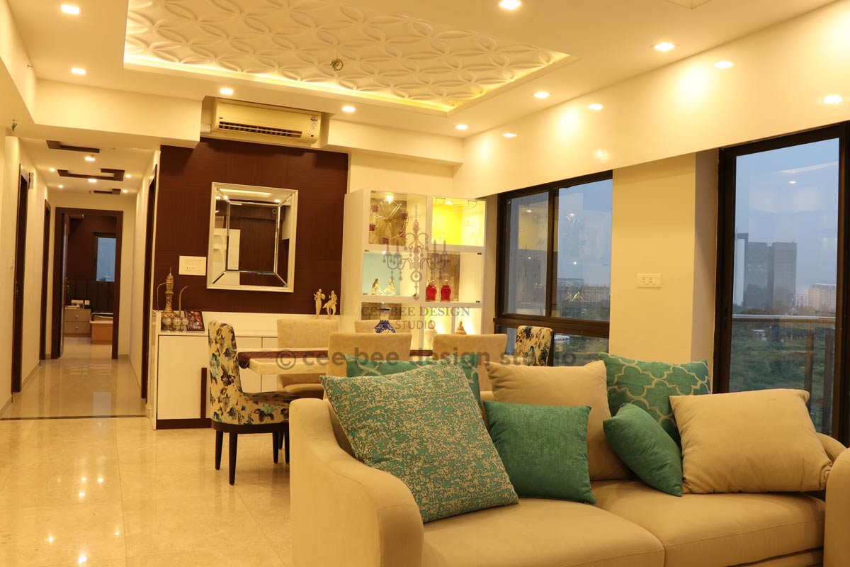
Space is a luxury when it comes to interior design. Mr. Saurav Bhattacharya’s home at Rajarhat provided us with that luxury to play with. They are originally based in Bhubaneswar and this is their Kolkata home that we got to design.
Aesthetics is an important part of designing but before that functionality tops our priority. Planning our layout in accordance to the way the client envisions his/ her abode has always been our forte and main plan of action.
This home has many stand out features that we would love to highlight.
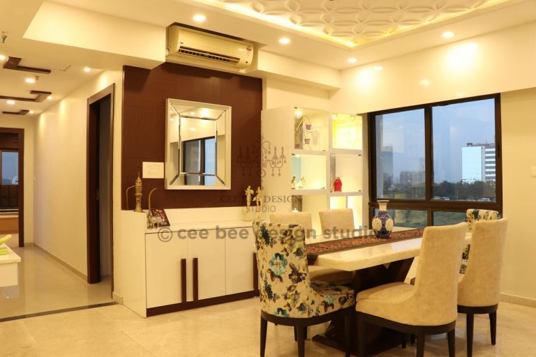
The first space that catches your eye as you walk inside the home is the passage space that consists of the welcoming foyer, the study area and the puja room.
It had been a block section that had the entrance through the living room. Somehow, we had to create a space within this passage accommodating the requirements keeping the space intact.
We decided to go in for a wooden partition to separate the section of the puja area and the study area. We went ahead and created a window seating in the study where a cup of evening tea can be thoroughly relished with a book in the hand. We call it our personalized relaxation spot.
The ‘L’ shaped nook on the wall acts as a shelf and is giving a trendy look to the study as a whole. On the other side of the partition, we created a panel area for the puja space making the design flow in an even and chic pattern.
Making space for storage too along with a seating area, the welcoming section of the residence iswarm and pleasing. Prefixed and suffixed with a welcoming feel, the abode spreads the aura of being homely.
So within the simple passage, we created all the three major requirements of the client.
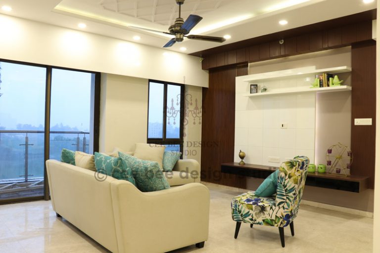
The living area is where the client will be entertaining family and friends and also it is the place where the people residing in the house will spend quality time together. Keeping it simple yet elegant, we decided to give the space a warm like family feel.
The living area is between the dining and the kitchen. We kept the basic theme of turquoise and beige for the living area. The absolute square space has a shelf and a TV unit that are a classic combination of wood and white.
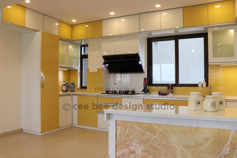
In a kitchen it is not just the food that is prepared but it is prepared and cooked with love taking into account everybody’s choices, their likes and dislikes. When it comes to the kitchen area every other client has the same theme in mind. Easy to access and bright on the eyes is what the clients generally prefer.
So it’s another yellow and white kitchen with lacquer finish, profile handles with white quartz countertop. The lift ups makes it easy for you to reach the higher level of the shelves and also gives more utility.
Not far away from the kitchen, the dining area is done with finesse where the family can share meals, share laughs and indulge in conversations with a plate of yummy and hot piping food.
The classic dining table is made out of white onyx. We kept colors of the chairs simple – Again beige with a little splash of turquoise.
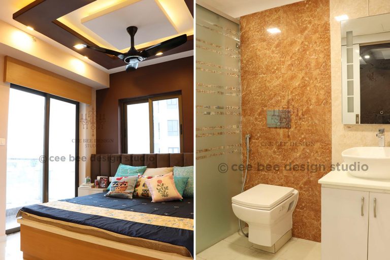
The master bedroom also has a similar theme of wood finish and white with a splash of purple. For the bedroom, we also changed the texture a bit from dark wood finish to beech wood finish to keep the ambience lighter.
Since the colours should flow in a neat pattern yet not give the client a monotonous feel of the living area, the bedroom has been given a catchier and brighter shade, keeping in mind that the client’s comfort should come first. The design we have chosen for the bedroom is comforting to the eyes and thus it draws one into deep sleep and mode of relaxation.
The bathroom again is quite simple with the theme of beige and Moroccan tiles.People often like to spend some lone time in the bath/ washroom to get a clarity of thoughts and thus we have gone in for a simple and uncomplicated approach while designing the same.
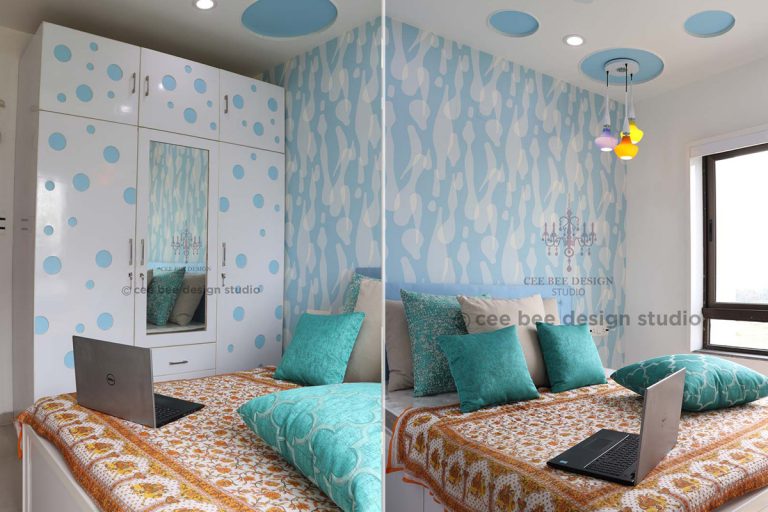
The abode has rooms for kids that are specifically designed keeping their choices in mind. While we have given the boy’s room a dual color theme with shades of blue and a simple oval design on the ceiling giving an edge to the room, the girl’s room is pink. Since the colour blue is generally associated with boys and pink is the favourite of girls, we decided to follow the set pattern.
The girl’s room is spacious and that gives her enough space for her knick knacks, her clothes and her separate study unit. The white and pink wardrobe adds up to the lively ambience of the room.
While the girl’s room turned out to be pretty, the boy’s room has been given a sportyfeel.
All in all, we can say thatMr. Saurav Bhattacharya had a ‘pleasing’ and satisfied experience with Cee Bee Best interior designer in Kolkata. He said, “Majorly our requests, demands and customizations that we had wanted were catered to. Even now they are helping us in doing minor modifications, helping us choose other minor designs, lights, artifacts. So in a nutshell, we are very pleased with the work, the craftsmanship and the final product that has been provided to us”.
We are interior design consultants, specializing in Interior Decoration and Turn Key Execution of Interior Works. Cee Bee Design Studio is one of the fastest growing interior execution companies. Currently we have very strong presence in Bangalore, Goa, Pune and Kolkata with over 500 completed residential projects and more than 20 commercial projects.

European Country Style Home Design at Kolkata
By: Cee Bee Design Studio
3 Bedroom Designs Created By Cee Bee Design Studio
By: Cee Bee Design Studio
Creating a Sober, Classy Look for A 2BHK Apartment in Bangalore
By: Cee Bee Design Studio
A Home in Bangalore Designed in Dubai Style
By: Cee Bee Design Studio